Discovering the knife person in anyone
CRKT
Celebrating the passion, perspectives and multi-dimensionality of our people
Brand Design Audit, Design Strategy, Brand Identity, Visual Identity System, Casting, Art Direction, Packaging Design, Illustration, Brand Guidelines
Whether a mechanic, a first responder, an adventurer, a homeowner, a do-it-yourselfer, an obsessive collector – CRKT believes anyone can be a knife person.
Knives can make everything seem possible and inspire us to discover something new.
CRKT aims to help anyone discover the knife person in themselves, by creating the right tools for any unique needs, designing with every life moment in mind, and carefully crafting to empower. CRKT’s tools help discover unknowns and celebrate all aspects of a knife person, their work and their passions.
Visual identity System
With a growing knife community, and increasing competition, CRKT wanted a complete brand overhaul to help secure their place as a hub of the knife and tool community.
The new visual identity system speaks to this multi-faceted community, demonstrating CRKT deeply understands and supports their needs. The new brand design also highlights their superior craftsmanship, passion and expertise.
The design system also acts as a vehicle to visually organize the brand’s rather extensive portfolio offerings, aiming to differentiate categories and tiers of products successfully by making it intuitive, strategic and cohesive.
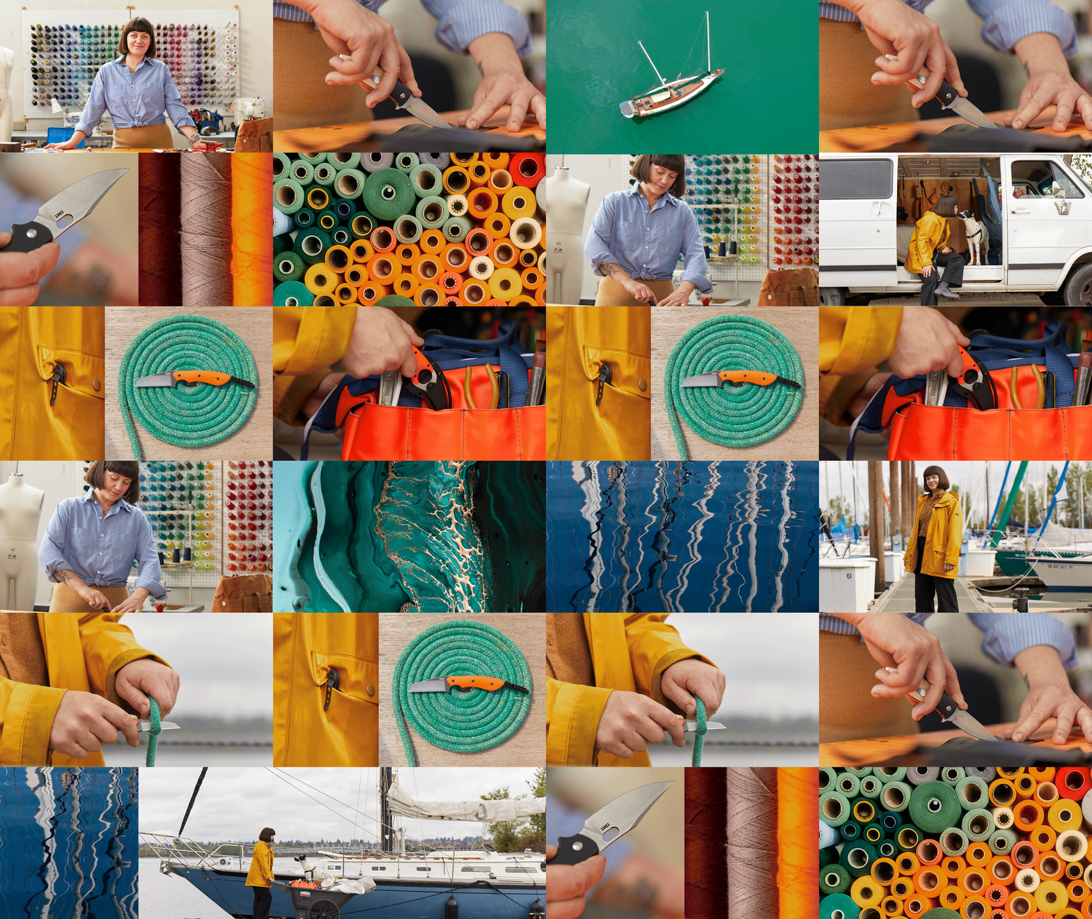
Moving the brand towards a lifestyle-centric approach, our brand photography is centered of real moments with real people. People who embody the essence of the knife community. They are passionate seekers who live life to the fullest. They are the ‘always down for anything’ people, the entrepreneurial spirits, the self-sufficient doers. They are determined to accomplish great things, but like to have fun along the way.
Our casting targeted real people who are clever, energetic, determined and accessible, demonstrating their true depth and dimension.
There’s a curious duality in how they live their passions and pursue professional success. This contrast is at the core of the CRKT knife community and is essential to their authentic, unique, and dimensional storytelling.
Brand Photography
Collages are a way to create a unique portrait of the knife user, once again highlighting contrasting aspects their personalities, hobbies or passions. At the same time, they also serve as a means to artfully portray the product.
Color
Motifs and Collages
Hand drawn graphic motifs are used to add a human touch, and depict or common environments of knives, falling into three categories: Everyday Carry, Getting things Done, and Pursuing Adventure.
A modular color palette ensures flexibility and stretch across categories and tiers.
Brand typography consists of contrasting type treatments that range from functional to expressive.
Leveraging a combination of primary and secondary brand typeface styles offers display messages the flexibility to express the new brand voice and modulate tone,
A clear type hierarchy for content messaging facilitates easy navigation of information.
Typography
Iconography
Implementation Across Brand and Product Tiers
The brand iconography style draws directly from the character forms inherent within the logo, creating a functional icon system that demonstrate key features, specifications and other product information
Applications & Launch Assets
Website
Guidelines
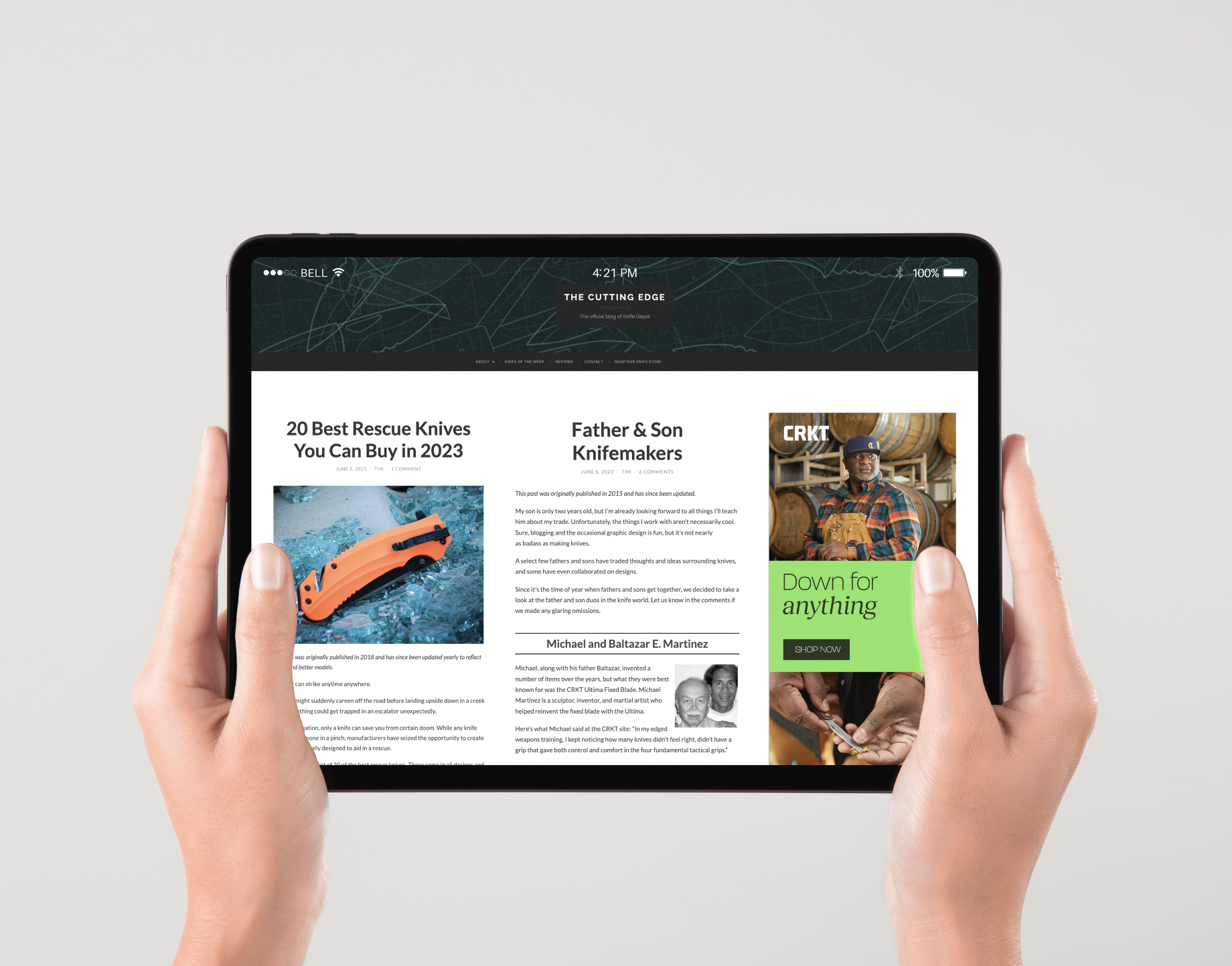
A complete website re-haul was carried out to launch the new brand, focused not only on product but depicting the true CRKT community of knife enthusiasts, leveraging the brand shoot and other brand assets to tell engaging stories.
A comprehensive guideline of 100+ pages detailed usage principles of each element across CRKT portfolio structure, considering how each element function across categories and tiers, highlighting ways to differentiate while also creating a consistent yet flexible brand, that can evolve with CRKT’s growing product portfolio and audiences.
Core brand visual elements like color, imagery, motif, typography and iconography work together to create a unified and consistent brand identity system.
Strategic implementation of the elements provide flexibility and range that lets them be modulated across categories and tiers of the product portfolio architecture.


